FRAMING JOHN DELOREAN - ON VOD www.framingjohndeloreanfilm.com
Results 1 to 5 of 5

Thread: McLaren font very similar to DMC font

  1. #1
    DeLorean Historian / Administrator Tamir A.'s Avatar
    Join Date:  May 2011

    Location:  Los Angeles / Chicago

    Posts:    629

    My VIN:    11474

    McLaren font very similar to DMC font

    Just wondering if anyone else has ever noticed how similar the McLaren font is to our DMC font? Sure, there are differences, but they are pretty subtle (minus the M and L that have hard edges). They even do the large L.

    McLaren font.jpg

    Not to be outdone, but the DNC company has a totally uncanny similarity to our DMC logo.

    DNCLogo.jpg

    Just thought I'd pass this along to those who think this is interesting.
    Fan of all things DeLorean!

  2. #2
    Senior Member Dangermouse's Avatar
    Join Date:  May 2011

    Location:  Atlanta OTP GA

    Posts:    7,084

    My VIN:    2743

    Club(s):   (SEDOC) (DCH) (DCUK) (DOC-UK)

    I noticed that a while ago too. very similar

    http://dmctalk.org/showthread.php?40...hlight=mclaren
    Dermot
    VIN 2743, B/A, Frame 2227, engine 2320

    I don't always drive cars, but when I do, I prefer DeLoreans

    http://www.will-to-live.org

    No-one is to stone anyone, even, and I want to make this absolutely clear, even if they do say "carburetor"

  3. #3
    Senior Member DavidProehl's Avatar
    Join Date:  May 2011

    Location:  Maple Grove, MN (Minneapolis)

    Posts:    1,423

    My VIN:    05457

    My wife is in a grad school program with a lawyer from Delaware North. She asked him about the font similarities and he said he had never heard about it being similar to anything else, and that Delaware North had been around since 1915 so it pre-dates DeLorean.

    Such a lawyer answer.

    I think it is safe to say they didn't start with the DNC logo in 1915.
    David Proehl

  4. #4
    Senior Member DMCVegas's Avatar
    Join Date:  Oct 2011

    Location:  Las Vegas

    Posts:    2,498

    My VIN:    6585

    The logos and company fonts were probably created back during a time when fonts were simply created by hand if they weren't already in a font case. Even the dealer advertising materials contained actual clip art.

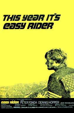
    It's hard to say just where the inspiration for the font came from. I've always thought it looked very similar to the font used for the movie Easy Rider myself. Which was then probably just modified for the car as happens. But in reality, until we hear something concrete about it's history, who knows where it came from?

    Robert

    People they come together, people they fall apart...

  5. #5
    DeLorean Historian / Administrator Tamir A.'s Avatar
    Join Date:  May 2011

    Location:  Los Angeles / Chicago

    Posts:    629

    My VIN:    11474

    Interesting. Didn't even notice that they had changed it from an older logo that looked less like the DMC font. For some lucky reason, I was invited to an exclusive test drive experience about a year ago near Chicago. I was able to take the 650S out for about 20 minutes, was a blast. Though most of the folks were more interested in checking out the DeLorean.

    IMG_9876.jpgIMG_9873.jpg

    I'm now heading up to Pebble Beach for the Concours show this weekend and was lucky enough to be invited to another one of these test drives, this time for the 570GT. Amanda McLaren will be on hand to discuss her father's cars. I will be sure to ask about the font and see if they are aware of the similarities to the DMC font.


    Quote Originally Posted by Dangermouse View Post
    I noticed that a while ago too. very similar

    http://dmctalk.org/showthread.php?40...hlight=mclaren
    Fan of all things DeLorean!

Posting Permissions

  • You may not post new threads
  • You may not post replies
  • You may not post attachments
  • You may not edit your posts
  •